Mini-Case Task «MovieNest»
Booking app
Role
UX/UI Designer
Timeline
Mini-case task · focused UX flow
About the project
MovieNest is an app for booking private movie rooms. While the overall concept is simple, one specific flow creates confusion and drop-off: users browsing room options struggle to understand what’s included, how to compare offers, and how to confidently start the booking — especially without calling the venue.
The Problem
Booking private movie rooms is inconvenient due to unclear availability, pricing, and services.
Users struggle to find promotions and venue details, while younger users hesitate to book via phone.
Instead of redesigning the full app, I focused on this exact moment where users hesitate. I wanted to solve it through structure, clarity, and better visual storytelling.
Focused UX Task
The flow I concentrated on — from discovery to a confident, no-call booking:
Browse rooms
Check details
Understand pricing & services
Start booking
Approach
To better understand the problem, I briefly reviewed user feedback in app stores and looked at how similar services present room or experience details. I also reflected on my own hesitation moments when booking unfamiliar venues.
Based on this, I focused on making room cards clearer and easier to compare at a glance. I introduced visual tags for key features, streamlined the content structure, and designed a layout that supports fast scanning.
Key Observations
Solution
Room Comparison View (Standard vs VIP)
To improve clarity during room selection, I redesigned the layout to show key details upfront:
Price per session
Maximum capacity
Features included in the booking
To support quick scanning, I introduced visual icons and a cleaner structure, making it easier to compare rooms without reading long descriptions.
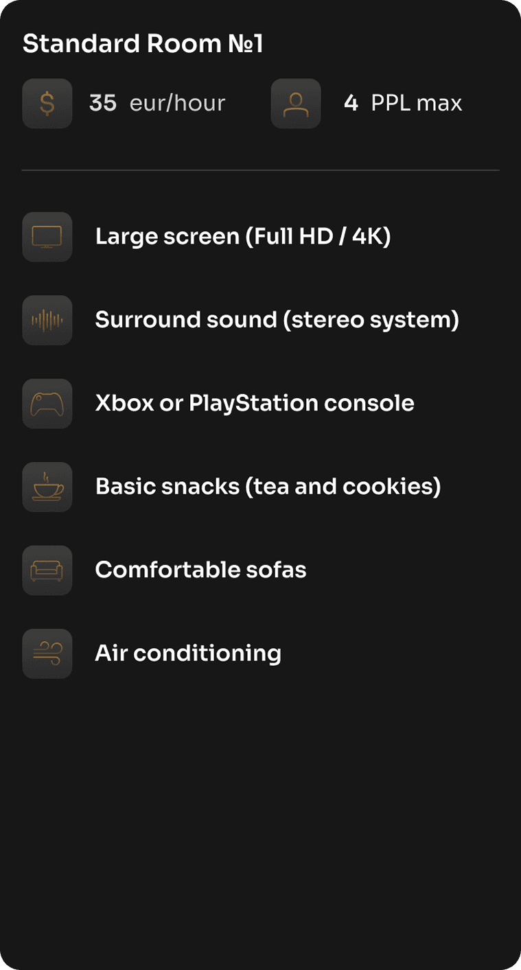
Standard room
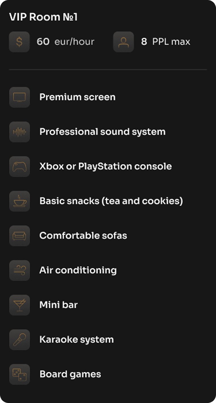
VIP room
Booking Flow — Step-by-Step Overview
The redesigned booking flow now includes a clear step indicator at the top to help users understand where they are in the process.
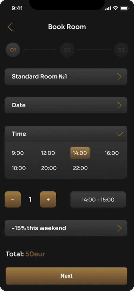
Select room, date, and time — including any available discounts.

Enter personal details and choose a payment method.
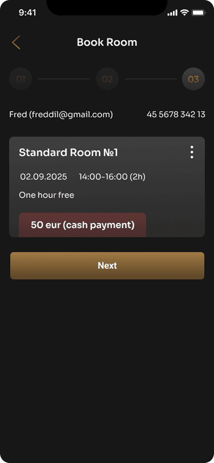
Review all entered information for accuracy.
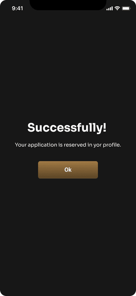
Final confirmation screen with a full booking summary.
Prototype
Next project
Intentional Matching